What is wrong with this "classic" Risk Matrix?
October 15, 2025
In real life there is no country with 200 years of observations. The challenge for Climate Scientists is to create datasets that could fullfill this gap. For this reason, the scientific community created climate models, often referred to as “digital twins of the Earth”. These climate datasets provide an extraordinary source of time series data, complementing the limited and sparse observational records.

Now that we have millions of data points, we can evaluate the probability of severe and extreme (high-impact) weather anomalies. The frequency of extreme events is described by the return period and their amplitude. The probability, or likelihood, is the inverse of the return period.

Rare events and major extremes have long return periods and low probabilities. Frequent events (small anomalies) may happen every other year: they have short return periods and high probabilities.
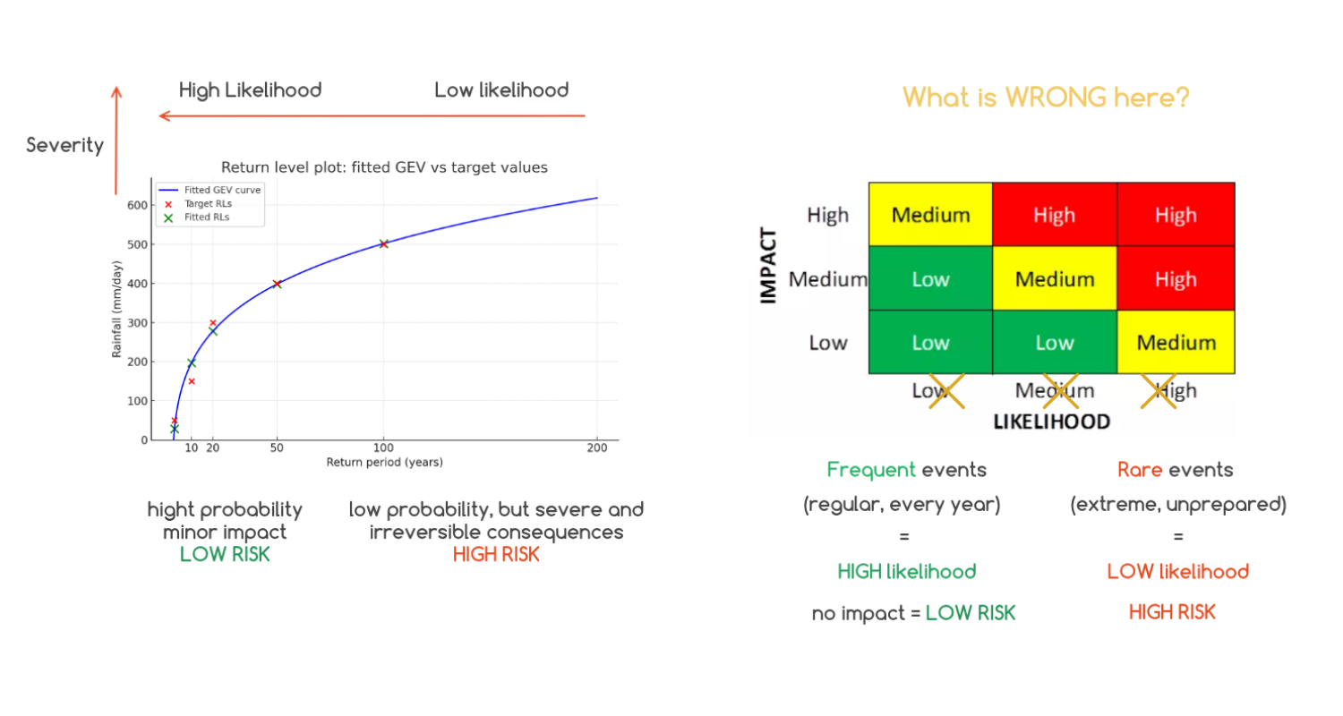
The Generalized Extreme Value (GEV) model translates a time series into severity (Y-axis) and frequency (X-axis) coordinates.

Plot with yellow time series illustrates the anomalies in extreme rainfall year by year over 200 years. At this stage, for extreme value modeling, we must ensure that the time series is detrended.
The blue curve represents the function that describes the behavior of these weather anomalies at a given location transformed into a severity – return period model. It begins with frequent, smaller anomalies that have low impact and high probability. The curve tells us, for example, that once every 20 years rainfall may reach 200 mm/day, once every 100 years it may reach 500 mm/day, and once every 200 years it may exceed 600 mm/day.
This kind of metric is the required for urban drainage system design, flood defense construction, and hydropower security planning.
Important message here : low probability does not mean low risk!
Risk Matrix
The Risk Matrix is the most common illustration used to explain the relationship between risk level, event amplitude, and likelihood. However, there is a common misunderstanding.
If we keep the colors of the Risk Matrix in it's original way, the likelihood axis (X-axis) is wrong: it should be inverse!

High-risk events are exceptional. They happen rarely, which means they have a low likelihood of occurring, but when they do, they cause major impact.
In contrast, events that occur frequently (every day or every year) have a high likelihood but low impact. These are low-risk events.
For extreme risk assessment, especially if there is no data available, the classic method is Monte Carlo statistical resampling. It generates the extreme values (once in 500 years extrems) for a very limited dataset. These simulations rely on predefined GEV coefficients.
In other words, instead of using real data, the results come from stochastic modeling. No surprise that companies lose money on extreme events, since these are based on invented distributions of anomalies.
At Weather Trade Net we calculate GEVs and evaluate the risk based on multiple climate models: we promote a 100% data driven approach. Scientific climate data provides a vital record of extremes and anomalies for risk modeling.